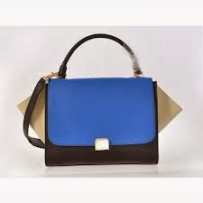
Celine was established by Parisian Celine Vipiana in 1945 as a children's shoe wear company, as an immediate success this pushed her into the women's clothing and accessories industry.
Post war 1950's Celine had predicted a high desire for luxury goods and created her own range of luxury goods items. After a huge success the label launched a line of ladies clothing. By the late 1950s there were lines of Celine handbags and Celine shoes for women, The popularity of these items brought new clientele and represented an elegant turning point for the business
From the 1960's Celine had nothing to do but rise, providing popular lines of handbags, shoes and clothes which incorporated a new middle class market as well as the elite. During the 1970's Celine was known as an international luxury brand with stores situated all over the world.
Vipiana believed that modern women did not need whimsical outfits, they needed chic clothes. The designer style of the brand was based around separates, the looks they created caught the imagination of modern women hungry for freedom and change. Celine collections were easy to wear and fundamentally Parisian yet global.

“Women grasped the idea immediately. They realized that Celine fashion was practical and easy care. The woman who travels can take lightweight things in one suitcase and remain neat and impeccable. For example wearing a skirt and blouse, which I made famous, was not in fashion”. In 2008 Phoebe Philo, the Paris born London based designer was appointed creative director of Céline. After graduating from Central Saint Martin’s in 1996 Philo went to work at Chloe with her friend Stella McCartney, becoming creative director of the label in 2001. In 2005 she was named British Designer of the Year and left Chloe in 2006 to spend more time with her family. In 2010 Philo was again named British Designer of the Year.


Celine as a brand doesn't use a lot of colour in an obvious way. The brand itself is a huge fan of colour blocking the process of putting colours that normally wouldn't go next to each other together. It has a colour palette of black, white, nautral and earth tones with a splash of colour.
Celine also uses pattern and has established it's very own 'Celine Check'. The main way in which Celine presents its elegance is through use of texture, the brand uses a lot of leather, silks and wools.
Celines most famous and iconic product is the 'Celine bag' worn by celebrities all over the world. It is most famous due to its chic, elegant look and through Celines use of fabric and texture incorporated into their bags.
After exploring into Colour Theory I expanded my research into looking into Colour Palettes more specifically for Tom Ford. On photoshop I created these colour palette variations using Tom Fords most recent campaign switching around colours, positions and shapes in order to find out what looked best.
Colour palettes are important when looking into a brand, it helps you to get a feel for what type of look the brand stands for before doing any research or looking at any garments.
Within a recent Lecture we were educated on basic colour theory which is vital to anyone working within the fashion/design theory. The idea of understanding basic colour theory can benefit you in many tasks such as presenting, buying, styling, co-ordinating, selecting, editing and analysing.
HUE
The name of the colour e.g blue, red, yellow
VALUE
The lightness or darkness of the colour
CHROMA
The intensity of the colour, its brightness and purity or dullness and impurity
TINTS
Hues with shades of white added
SHADES
Hues with shades of black added
TONES
Hues with shades of grey added
Colour Types
Primary Colours-
RED
BLUE
YELLOW
Secondary Colours-
BLUE-GREEN
BLUE- PURPLE
RED-PURPLE
RED- ORANGE
YELLOW-ORANGE
YELLOW- GREEN
Tertiary Colours-
(are obtained by mixing all three primaries with a secondary colour e.g)
ORANGE + BLUE
GREEN +RED
PURPLE + YELLOW
Behaviour Type
Harmonious Colours- those that lie next to each other on the colour wheel. They sit easily together and graduate gently.
Contrasting Colours- those that lie far apart from each other on the colour wheel. They sit uncomfortably together and clash against each other.
Complementary Colours- those which lie opposite each other on the colour wheel, when placed together each colour intensifies the other. Adding a very small amount of complementary colour to another subdues the intensity by dulling the colour domain.
Discordant Colours- are created by reversing the natural order of colours e.g red is naturally darker than orange. If white is added to create pink, then the pink becomes discordant with the orange.
The lecture itself opened my eyes into exploring a wider range of colour types rather than the typical generic colours.